Data Visualisation
Visual storytelling comes in many forms, and one of the most vital, powerful, and concise is data visualization.
The Minard Map
“The best statistical graphic ever drawn“, is how statistician Edward Tufte described this chart in his authoritative work ‘The Visual Display of Quantitative Information’.

This is at once a chart, a graph, and a map. It uses latitude, longitude, direction, time, temperature and size to tell the story in one easily readably image the destruction of an army. Minard shows us the staggering loss of life of French troops fighting for Napoleon as they march on Moscow and retreat. 442,000 French soldiers enter Russia. Their loss of life as they move deeper into Russia is represented by the diminishing brown line, which should be read from left to right. Their retreat is represented by the black line from right to left, and the temperature is represented by the bottom graph.
This text is by the author of the chart: Charles Joseph Minard (1781-1870), a French civil engineer who was an inspector-general of bridges and roads, but whose most remembered legacy is in the field of statistical graphics, producing this and other maps in his retirement.
“Figurative Map of the successive losses in men of the French Army in the Russian campaign 1812–1813.
Drawn up by M. Minard, Inspector General of Bridges and Roads in retirement. Paris, 20 November 1869.
The numbers of men present are represented by the widths of the colored zones at a rate of one millimeter for every ten-thousand men; they are further written across the zones. The red [now brown] designates the men who enter into Russia, the black those who leave it. The information which has served to draw up the map has been extracted from the works of M. M. Thiers, of Segur, of Fezensac, of Chambray, and the unpublished diary of Jacob, pharmacist of the army since October 28th. In order to better judge with the eye the diminution of the army, I have assumed that the troops of prince Jerome and of Marshal Davoush who had been detached at Minsk and Moghilev and have rejoined around Orcha and Vitebsk, had always marched with the army.
The scale is shown on the center-right, in "lieues communes de France" (common French league) which is 4444 m (2.75 miles).
The lower portion of the graph is to be read from right to left. It shows the temperature on the army's return from Russia, in degrees below freezing on the Réaumur scale. (Multiply Réaumur temperatures by 1¼ to get Celsius, e.g. −30 °R = −37.5 °C) At Smolensk, the temperature was −21° Réaumur on 14 November.”
Grechko and Romanenko Cyclogram. Salyut 6

Handwritten cyclograms were often used by the Soviet Space Program to plan the launch, flight, and landing of Soviet space missions. This is the most famous example, described by Edward Tufte, an American statistician and professor emeritus of political science, statistics, and computer science at Yale University in his seminal book Visual Explanations (pp.92-95) thus: “The SALYUT 6 mission, at 96 days, the longest manned space-flight to its date. Cosmonaut Georgi Grechko and Romanenko organized the chart before launch so that "in a single view it would reveal the entire flight program. We thought it would be handy and convenient to have such a chart aboard the space station." Once in space, the chart proved a grim reminder of the many days ahead: "it came to be quite unpleasant." They changed their design of the cahrt to make it less depressing by subdividing the program into marked weeks, and added the marks ¼-, 1/3-, ½-way dates, etc, "but this dodge did not help us much." They also folded the chart like an accordion and unfolded it so that the visibly uncolored portion would never be visible for more than 15 days at a time. "This made us more comfortable in this flight of world-setting duration."
"Their cyclogram eventually measured the demanding passage of time with fully eightmethods, all plodding along in parallel: phases of the moon, holidays, weeks (red tick marks), fraction of total flight, dates (each newly completed day was colored with a red triangle), elapsed days, total weeks to go and total weeks finished" (Tufte). Their redesign will "remain forever the first to redesign an information display while in outer space. Transitions between day and night are shown by contours outlining gray bands of darkness and yellow bands of daylight, as the vertical axis shows the time of a single orbit (91 minutes, starting at the equator). This grid plots time by time: orbit time in minutes (vertical) by trip time in days (horizontal). For example, on the 84th day reading up, one full orbit around Earth consisted of 20 minutes of daylight. All told, the cosmonauts experienced some 1500 sunrises and 1500 sunsets during their mission".
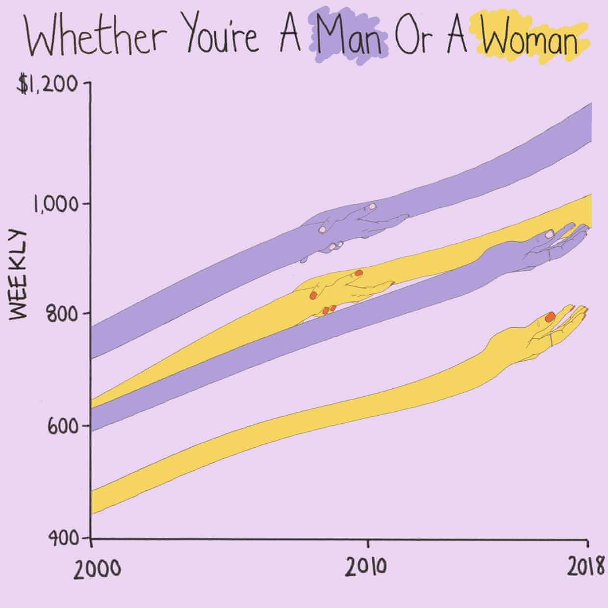
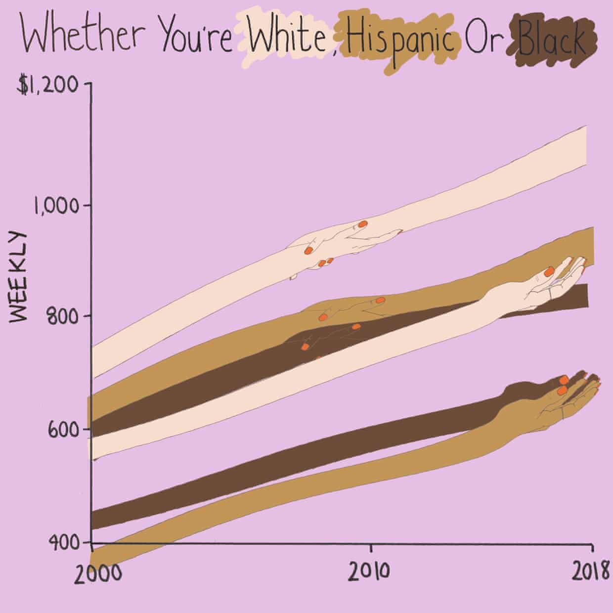
The Guardian: How much does union membership benefit America's workers?

Swiss Cartography
Cartography is one of the most recognizable and vernacular forms of data visualization, and in my view, the Swiss make some of the most beautiful topographical maps.
Courtesy of https://atlasofplaces.com “This 1:50’000 map was drawn by the Bundesamt für Landestopographie, under the cartography director Francis Jeanrichard. It took five years to complete and was published in 1988 as a supplement to National GeographicMagazine (Nov 1988). The result is a masterpiece of Swiss cartographic relief. Described in a review for the Geographical Journal: “[it] will remain the standard for a generation and reflect great credit on all who have been concerned in [its] making.”
